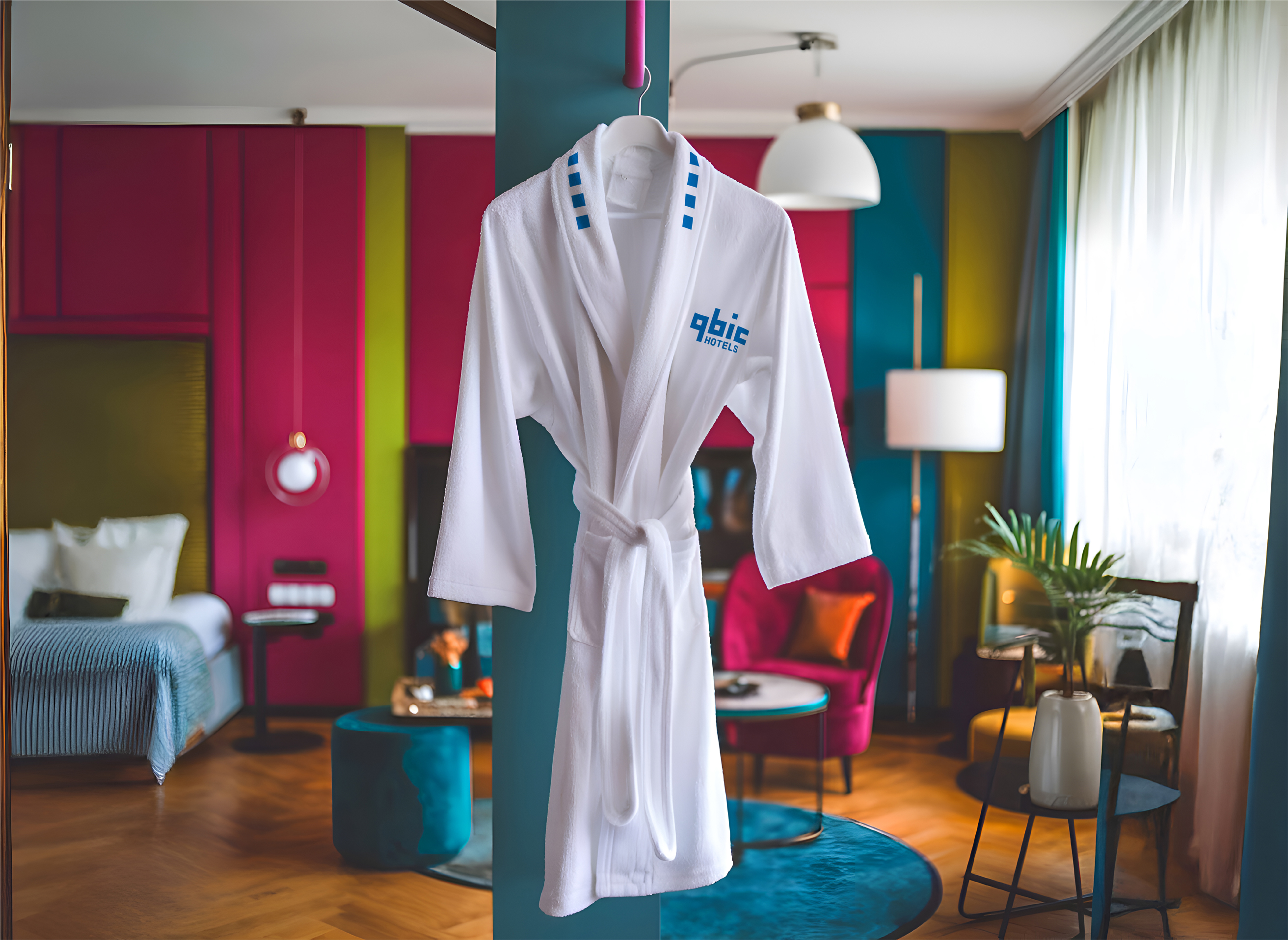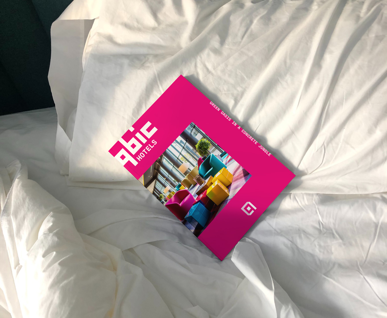
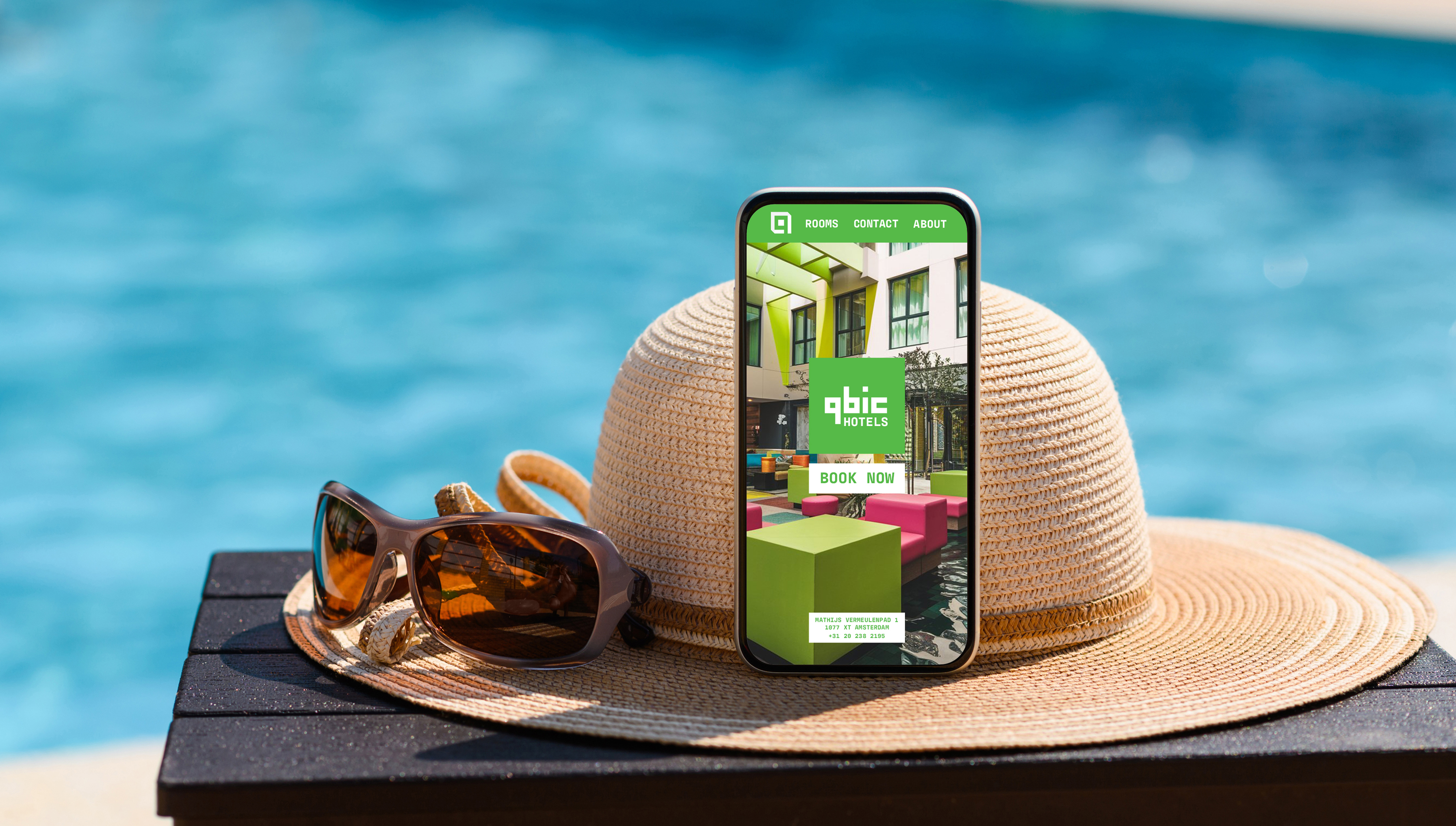
Qbic Hotels is a boutique hotel brand based in London and Amsterdam. Known for its eco-friendly values, vibrant colours, and relaxed, youthful atmosphere, Qbic offers guests a cozy, modern space to unwind, catch up with friends, or get some work done. The hotels blend comfort with creativity, reflecting the lifestyle of today’s urban traveller.

The goal of the rebrand was to capture the playful, stylish essence of Qbic Hotels. The design needed to reflect the signature elements of the brand, its geometric, colourful interiors and iconic cube-shaped beds, while modernizing the visual identity to feel fresh, welcoming, and in line with Qbic’s unique vibe.


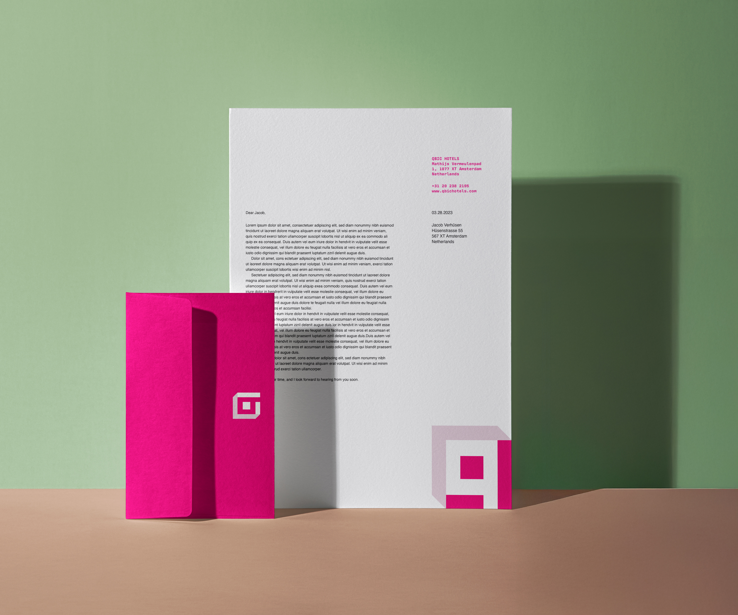
We started by immersing ourselves in the Qbic experience, drawing inspiration from its interiors, guest interactions, and sustainable ethos. The focus was on translating the hotel’s visual personality into a bold and contemporary identity. The use of geometric forms and vibrant hues mirrors the hotel decor, while clever use of space in the design brings in subtle, memorable details.
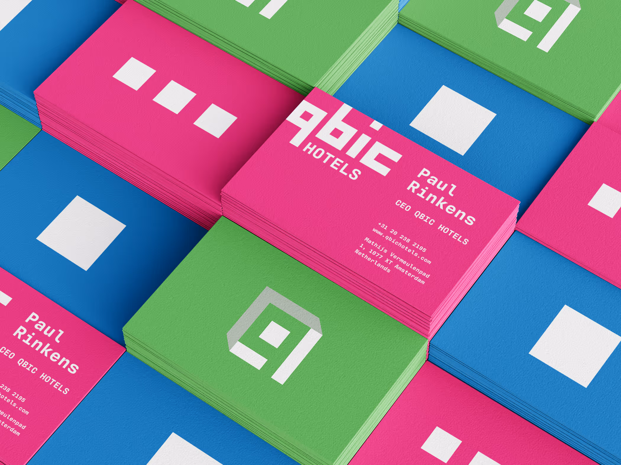
The rebrand began with the creation of a new logo, built using bold colours and clean geometric shapes. The design features a smart use of negative space to subtly form the letter “q”, reinforcing the brand name while keeping the style fun, sleek, and modern. The result is a visual identity that feels energetic and aligned with Qbic’s commitment to creativity, comfort, and sustainability.